
We had a lot of fun with this project for a lovely owner. The Cantius 48 would be the third boat to carry the Cubbie Bear name and the owner was keen to have a bear cub graphic to accompany the name. We put together a couple of treatments for the bear cub graphic and then set about designing the lettering to accompany the owner's cub selection.
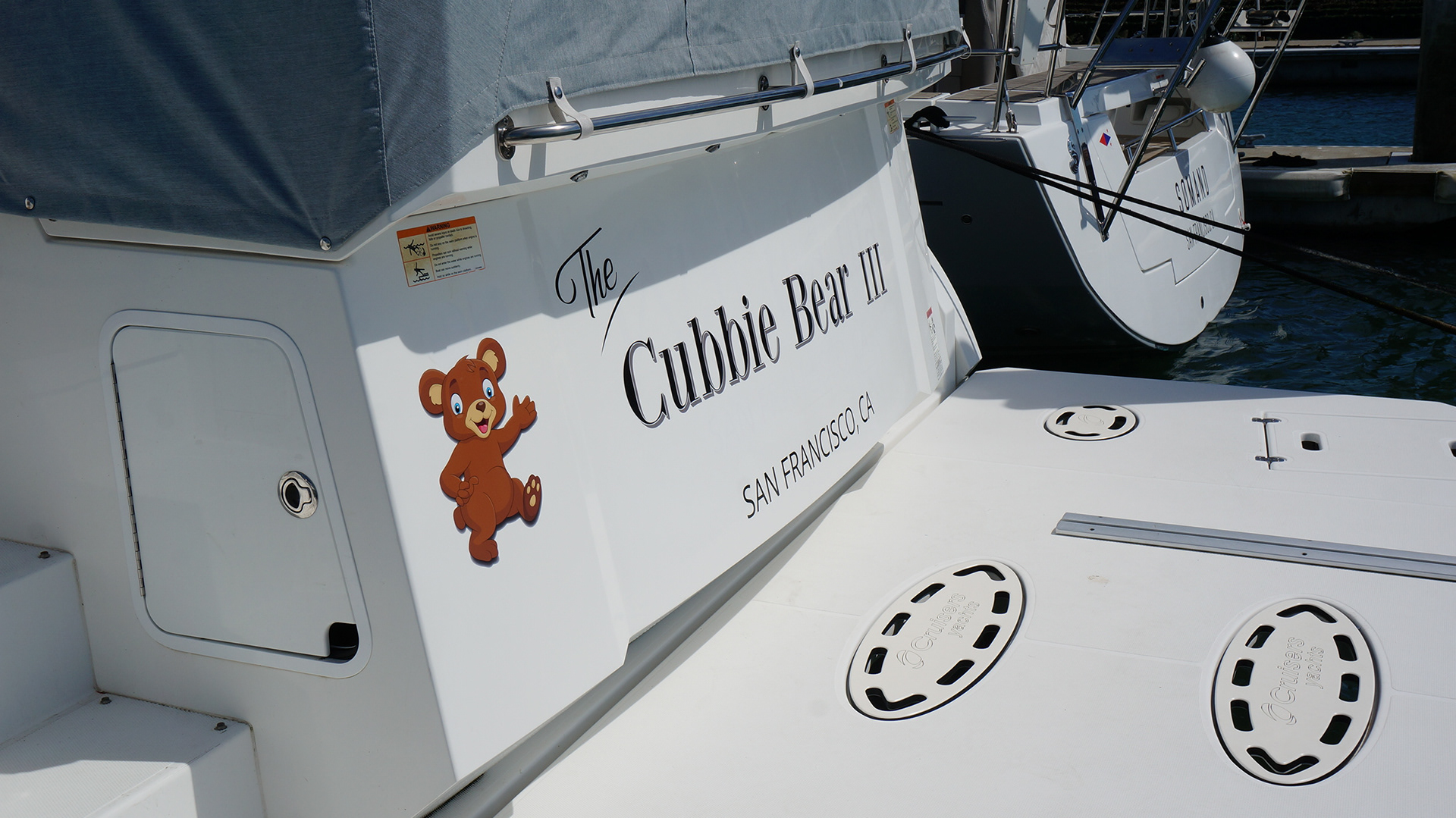
The owner liked classic typography, so we tied the classic lettering look together with the bear cub with a fun and playful treatment for 'The'. Our design brief called for a large name layout, so we balanced that with the hailing port treatment and positioning of "The" - which was ultimately the most important word in the name treatment! And our little bear cub points the eye to the key word.
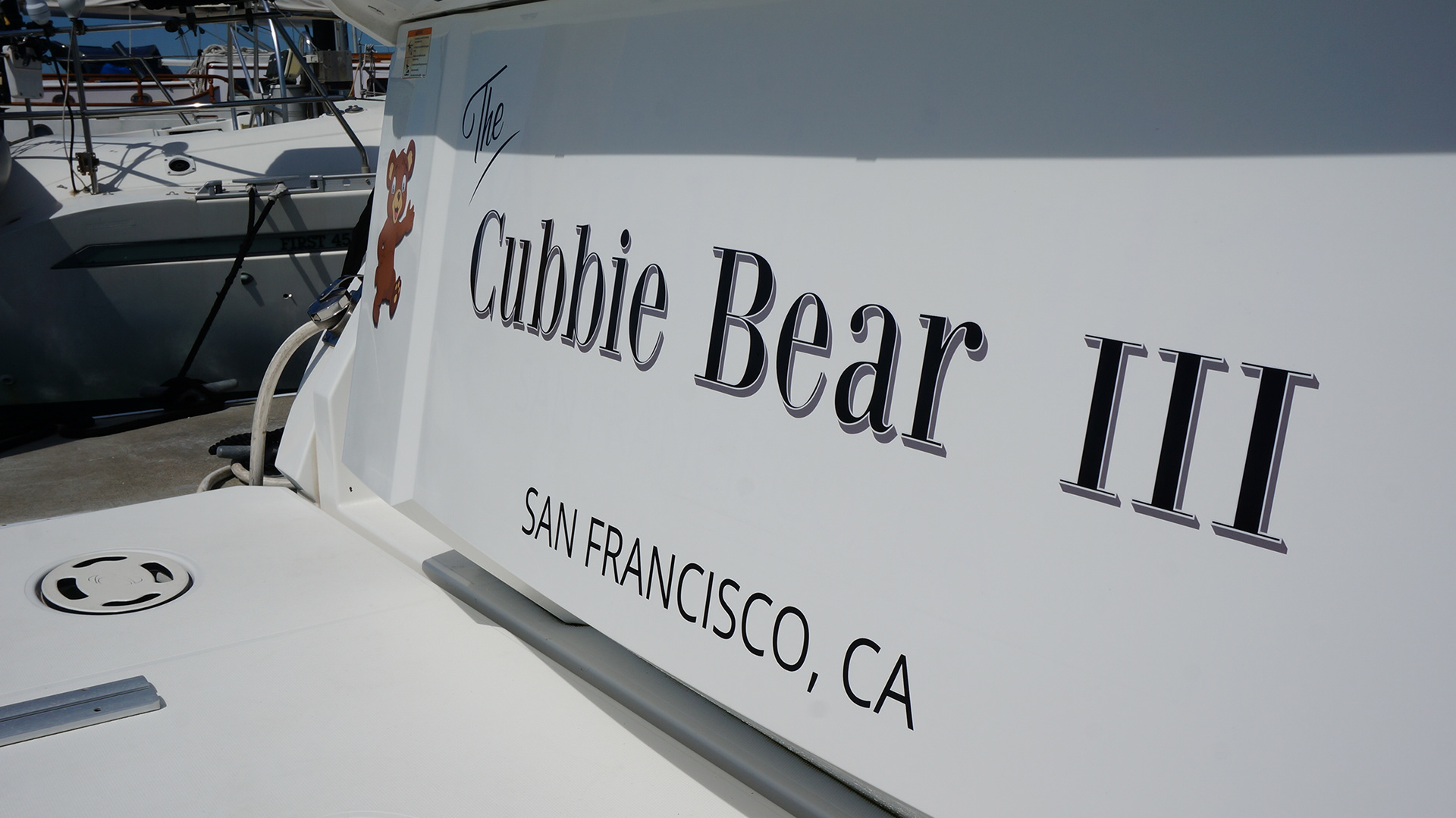
A simple medium gray back shadow and white pin striping worked to 'pop' the lettering and in the engineering of the production file we corrected for a slight convex bow in the transom to get the alignment right.